
Why do we need to tell a story with data?
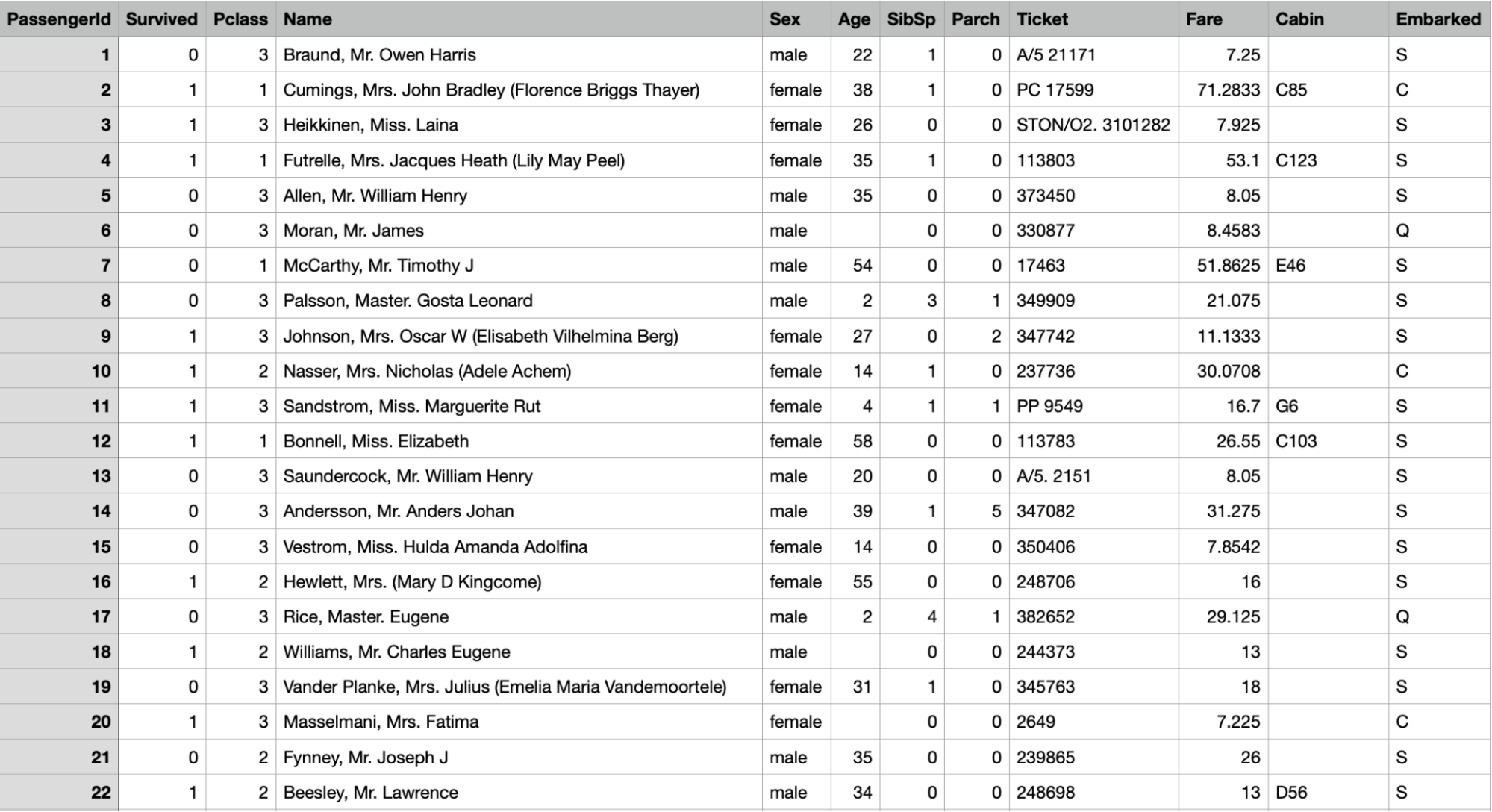
By Insight team on March 11, 2022Here’s some data about a ship that crashed:
Here’s the story that makes you care:
As a data scientist, if someone comes to you with a question, they probably already have the data available to answer it – but may not necessarily know how to interpret it. If you then present your audience with a spreadsheet, the chances are they won’t know where to start looking for what the data is telling them… and instead just won’t look at all.
Without picking out the key insights and guiding a narrative around them, it’s incredibly difficult to engage your audience with data, and even more difficult to persuade them to take action off the back of it.
Building a data narrative in practice
To exemplify the power of storytelling with data, consider this simple example. Here’s some data about employee headcount at Peak over the years, by country:

This spreadsheet had 161 rows of data populated like the above. In this format, it isn’t very engaging for the audience and would be difficult to draw out any insights from.
Using the key questions outlined above, we can look at how to create a story from our data:
- Who is your audience? In this scenario, our audience would be the Peak Talent team who manage recruitment
- What do they want to understand? Our audience want to understand the factors which may have influenced headcount from the founding of the company to the present day in order to identify opportunities to reach their 2022 target
With these questions in mind, we can begin visualizing our data and adding context to form a narrative for our audience. Take a look at this Google Slide presentation…
By gradually adding in annotations on key events from the history of Peak, such as funding rounds and new locations, we are now guiding the audience to read the story of ‘factors which may have influenced headcount.’
Through creating a narrative, our overall story for our audience is that funding rounds tend to be followed by an increase in headcount across all countries. We can also infer headcount has been rising at a faster rate in recent years, and we have also seen an increase in funding rounds, expanded our footprint in India and established a new presence in the USA.
There is now little effort required from the audience to gain insights from these visuals.
Conclusion
The power of a data narrative is shown through its ability to input raw data, and output an engaging story. To do this, keep in mind the questions of: who is your audience? and what are they trying to understand? Remember, data can be shaped to tell a multitude of stories. Keeping these questions in mind is an essential practice to ensure your narrative is communicated effectively!
Coming up soon…
Storytelling with data part two: visualization best practice
Next time, we’ll look at best practice for visualization and how to create spectacular charts like those shown above to impress and engage your audience.
Join our inclusive data community!
The Peak community exists to support data scientists and analysts who want to make a difference and drive change within their organizations.
More from the Peak data science team

How to leave academia and get a data science job

Under new management: tips for taking ownership of a long-running data project