Storytelling with data, part 2 – Visualization best practice
By Andy Lau on April 1, 2022 - 5 Minute ReadHow can we tell a story using our data? In this article, we take a look at how we can most effectively use various data visualization tools to complete the task at hand.
For those that missed our first installment, we took a fairly boring dataset about Peak’s headcount over time and brought the data alive by visualizing it and creating a narrative for the audience to follow. You can read more about it here.
We will continue with this example and explore some best practices for data visualization.
Why do we visualize?
Humans love to visually process the world, so why is data so often presented to us in a way which doesn’t engage our brains?

How would you feel if presented with a spreadsheet like the one above? The answer to this question is likely ‘unengaged’ or ‘bored’.
Alternatively, visualizing data in a chart means…
- Information can be understood much more quickly and effectively
- Your audience is more likely to engage with the insights you’ve uncovered
- It provides a medium that is easily digestible to a wide variety of audiences
Visualization in practice
Let’s look at some alternative ways of visualizing the Peak headcount data.
In this example, we use pie charts to visualize the global headcount over the years.

Humans love to visually process the world, so why is data so often presented to us in a way which doesn’t engage our brains?
Andy Lau
Insight Data Scientist
What makes this so ineffective?
- Given that we are visualizing data over time, are pie charts appropriate? It is extremely difficult to see any trends. Peak’s India headcount in 2020 is almost ten times what it was in 2016. Is it easy to tell?
- Your reader has to keep track of the chart labels as they change every year. This is a lot of effort.
- It is also ambiguous what the chart is showing. Is this showing the start or the end of the year? A little commentary (or better yet, a different type of chart) would clear this up.
Perhaps a stacked bar chart would be a little better?

This is better as this provides a clearer trend of headcount over time compared to the pie charts. However, there are still some things to consider:
- This chart is very busy as each month has a single bar along with up to three groups. This will likely overwhelm your reader.
- Nothing really draws the eye’s attention, so it is left to the reader to process the chart in its entirety.
- Without some context, a lot of the interesting information is lost. Why did it take so long for headcount growth to pick up some momentum?
In our final example we fix these issues by utilizing a line chart:
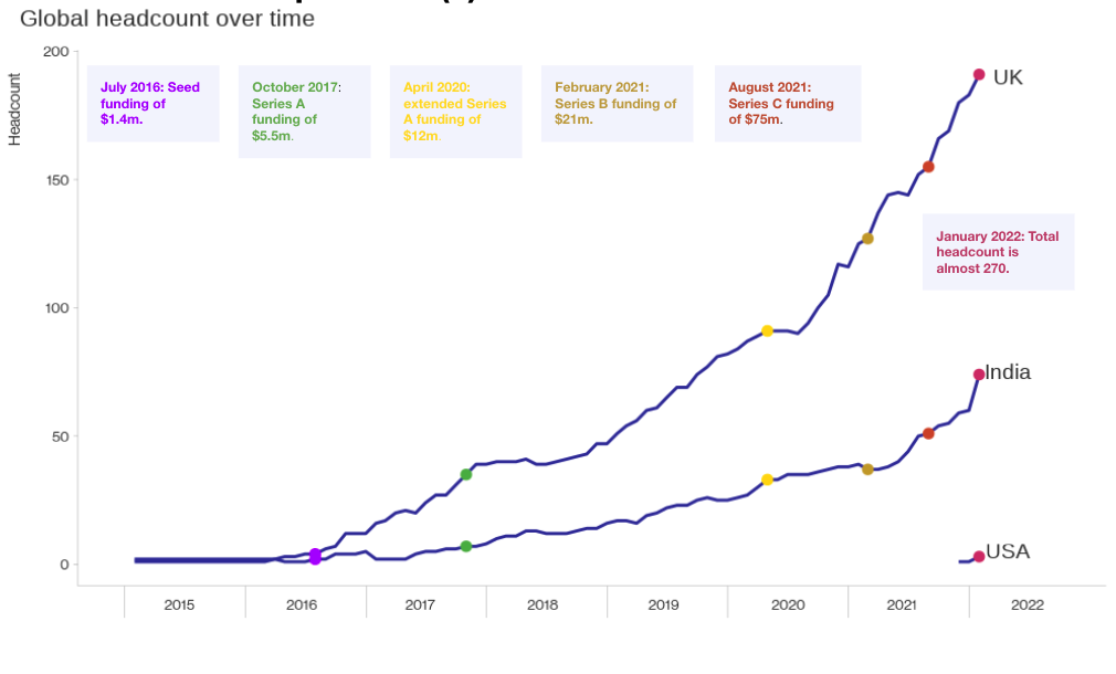
Why is this a better visual?
- We chose a more appropriate chart. The use of a line chart effectively shows the trends over time and is a lot less busy than the stacked bar chart.
- Elements of the chart are simplified. Instead of a legend, we labeled the lines directly so the reader doesn’t have to bounce between the legend and back too many times.
- Commentary and color is used as a storytelling aid. Annotating interesting data points bring to life the trends and provide some much needed context. Notice how color is also used to direct the reader’s attention to matching commentary.
Key Takeaways
Here are some best practices for producing an effective chart.
- Pick a suitable chart. The choice of chart is the first and arguably one of the most important decisions when visualizing data. What are you trying to communicate to your audience? What is the most appropriate chart to convey this message?
- Make sure your chart is not too busy. Don’t be tempted to include everything in your visual, as this will likely overwhelm your reader. Remove all non-essential clutter from your charts so the reader can concentrate on the main message.
- Words and color are a useful aid. Commentary can provide some needed context to a chart. Color is also a great way to direct the reader’s attention. However, be sure not to use too many, otherwise it can become distracting!
Coming Up…
The final installment of Storytelling with Data: Standardizing Visualizations
Could this be you?
Think you could rise to a data visualization challenge? Check out our current Data Science vacancies.
More from the Peak data science team

How to leave academia and get a data science job

Under new management: tips for taking ownership of a long-running data project